
Responsive Web Design (RWD)
Find out what's happening near you!
EventAware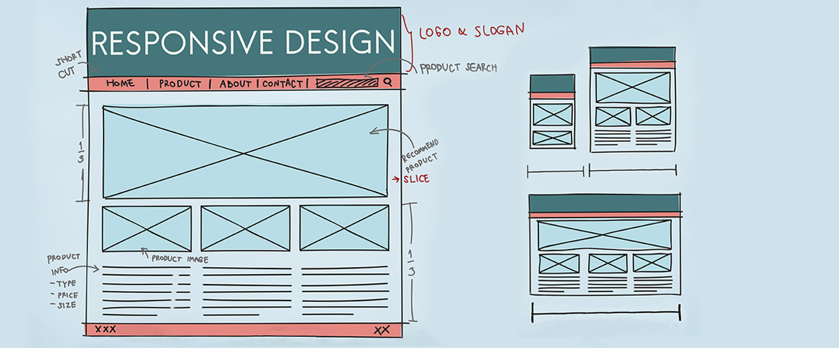 Responsive Web Design
What is Responsive Web Design?
Everyone’s talking about it, but just what is Responsive Web Design (RWD) and what does it mean for your website? In a nutshell, RWD means creating a website that looks lovely on any screen or device; whether it’s a desktop PC, a mobile phone and everything inbetween.
Before we look at RWD, let’s start at the beginning...
Fixed-width websites
Fixed-width websites have been the most common type and are designed around a fixed layout of a certain width. In the early days of web design, websites were built with a fixed-width of 600-800 pixels, but as screen sizes increased, websites got wider (anything up to 1200-1600 pixels). When viewing a fixed website on a smaller screen, the internet browser scales the whole website, which unfortunately means the user has to ‘zoom in’ to be able to read the website content. The bigger the fixed-width of a website on the desktop, the smaller the website site will look on a mobile screen.
Mobile Friendly
The first solution to address the shortcomings of fixed-width websites were mobile friendly websites. This entails a website recognising that a user is browsing on a mobile device and redirecting them to a mobile version, where the design and content has been adapted for a small screen (9 times out of 10 you can recognise this by the appearance of ‘m.’ at the beginning of the URL).
However, mobile friendly websites require two different websites to be created and maintained (one for desktop and one for mobile), so if new content is added to one site, then it must also be added to the other. It is also common for some content that appears on the desktop to be removed for the mobile version, i.e. images and forms may not be included due to size restrictions.
Flexible Web Design
The huge selection of desktop monitor sizes available nowadays, means that fixed-width websites are not just a problem for mobile devices. For instance, a fixed-width website that is 1200 pixels wide will not display properly on a monitor that is only 800 pixels wide (content would be cut off on one or both sides!). Enter Flexible Web Design!
Flexible (or Liquid/Fluid) websites shrink or grow based on the size of the user’s browser, by using percentages instead of pixels. So for example, if a website has one column at 25% and another column at 75%, when the browser is resized, the columns and content automatically adjust their width to always be 25% and 75% of the total browser width. However, a mobile website version would still be required, as unfortunately the percentage columns do not allow for much space on a mobile screen (imagine a column of text that takes up just a ¼ of the screen width on a mobile phone!).
Responsive Web Design (RWD)
RWD allows a desktop website to shrink and grow for any screen size, as well as morphing into a single column layout when displayed on a mobile screen (so no separate mobile version required!). Using percentages and a technique called media queries, not only will the website layout adapt to any screen, but also fonts and images can change size for all the different browser sizes. It also means that exactly the same content that appears on the desktop website can appear on a mobile device (albeit with changes in image sizes, to make it all look great!).
Want to see Responsive Web Design in action?
The koolth website has been built using RWD, so if you are viewing this on a desktop, simply resize your browser to see RWD in action. If you are looking at this website on a mobile device, just view it in landscape and portrait modes to see how it adapts.
Why is Responsive Web Design important?
Recent studies have shown that nearly 80% of all website traffic is from mobile devices, and this is only going to increase. RWD allows your website to automatically present the content in a way that any user can easily view and navigate - no more cut down mobile versions or tiny websites that you have to zoom to use.
ARTICLE TAGS: RESPONSIVE WEB DESIGN | WEBSITE | WEB DEVELOPMENT | WEBSITE DESIGN | KOOLTH | ADELAIDE | SOUTH AUSTRALIA
Who are we?
koolth is a smart web specialist company. We empower clients with next generation online tools and transform businesses by providing powerful online experiences, expert web solutions & world-class AI education programs.
Adelaide AI Event (18 Nov '19)

We’re excited to announce our next Adelaide Artificial Intelligence Meetup......
Latest work

Find out what's happening near you!
EventAwareEmma & John from koolth have shared my journey and vision. They have been so enthusiastic, genuine and honest through the development process.